Designing Academic Posters
May 29, 2017 in Announcements, Manuscript Studies
Steady on the Page
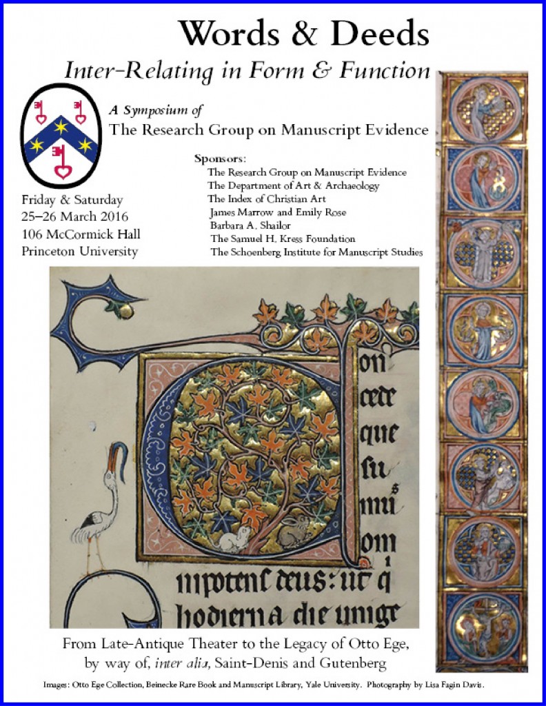
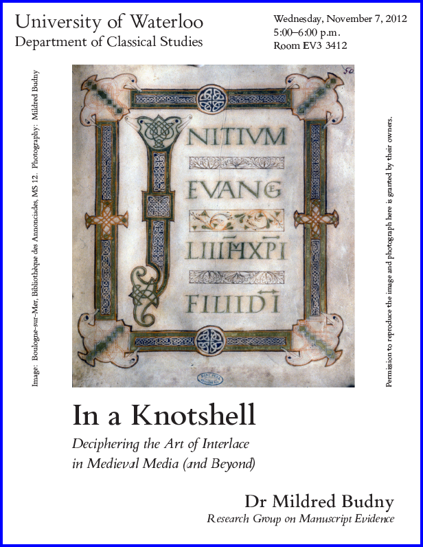
 Continuing to reflect on the values of presenting materials, whether text, image, or both, upon a page or writing surface, we have decided to proclaim the principles which guide our approach to layout of posters. You may have noticed some of them at our events, on the Posts of Pages pertaining to them, and/or in the Poster Gallery on this website.
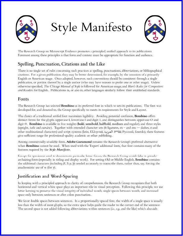
You may know already about our views about design and layout, for example in the Illustrated Catalogue (our own design throughout, apart from the front covers and the promotional booklet), in our Style Manifesto (we are not so shy, uncommitted, or wimpy, as to call it a “Style Sheet”), and in all of our Publications.
Principles and Principled
Now we offer a similarly clear, and polemical, description of principles which we believe should govern the processes, and products, of Designing Academic Posters. The 4-page Booklet, set in RGME Bembino, describes and illustrates the aims.
You may download our booklet in whichever form you prefer:
- Designing Academic Posters set out in 4 individual letter-sized (or quarto) pages
- Designing Academic Posters as Booklet laid out on 11″ × 17″ sheets for folding into a 4-page booklet in consecutive reading order
We adopted this dual form of publishing our Booklets for some earlier cases, as with the Report on some New Testament Leaves in Old Armenian. Its 20-page Report appears both as
- Armenian Pages set out in individual letter-sized (or quarto) pages
- Armenian Booklet laid out on 11″ × 17″ sheets for folding into a booklet in consecutive reading order
Experience shows that some of you may prefer the second option, so we continue the provision.
Enjoy!
Examples from our Poster Gallery
What do you think? We invite your comments. We’d be glad to improve.
And another favorite:
Please let us know your favorites! We’d be glad to hear from you!
Comments here or Contact Us.
*****


