Spoonful of Sugar
April 27, 2016 in Manuscript Studies, Photographic Exhibition
A Reused Medieval Bifolium from a
Latin Treatise on Medicinal Substances
13th Century?
Double columns of 57 lines
with rubricated headings
and
initials and paraph marks
rendered in alternately red or blue pigment
and embellished with extended penline-flourishes in the contrasting pigment
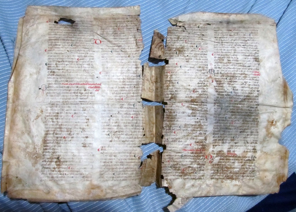
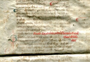 Continuing our blog on Manuscript Studies, we illustrate a fragmentary medieval bifolium, much damaged, from a large-format manuscript retrieved (without recording the contextual information) from its long-term reuse as the vellum cover of an unknown book with a thick back. The reuse, at an unknown stage, presumably took advantage of an out-of-date medicinal textbook. Shame on the retrievers for not recording and letting us know the location from which the bifolium was removed.
Whereas many reused medieval manuscripts survive from discarded religious texts rendered obsolete by changes in liturgical practices and religious beliefs, for example during the Reformation, the French Revolution, or less catastrophic (r)evolutions, this case represents a relic, or battered fossil, of advances — or anyway transitions — in scientific, medical, pharmaceutical, and related spheres of knowledge in Western Europe. Some of our posts describe the former; now we turn to the latter. Here, we mainly allow the pictures to do the talking.
Inside / Outside
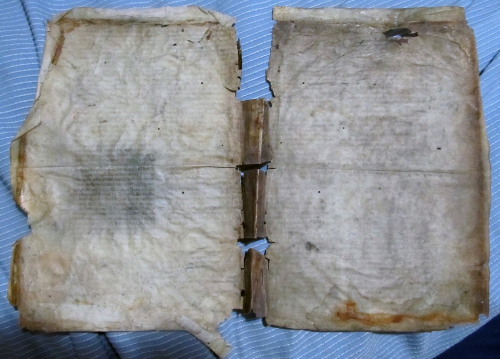
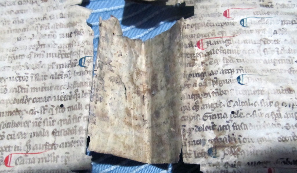
Only the inside of the bifolium of the medieval medical treatise in Latin retains legible text; the outside is scraped to illegibility, which back-lighting does not enhance. Which side was inner and which was outer in the original bifolium is established clearly by the sharp contour of the fold between the conjoint leaves. That fold derives from the original gutter of the bifolium, which the reuse centered along the spine of the secondary book. The color and texture of the two sides of the bifolium indicate that the hair side of the animal skin was turned outward and the flesh side turned inward in the layout and assembly of the written surfaces.
In the reuse, after removing the bifolium from its original manuscript home, the reuser(s) spread it out, scraped or washed away its text from the ‘exterior’ side, wrapped the bifolium around the textblock of whatever new unit was its destiny, and folded inwards the upper, lower, and outer margins to form the enclosing turn-ins of the new binding.
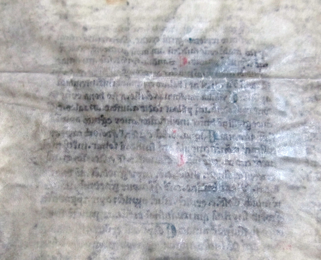
Scraping the surface of the outside of the new cover served to obliterate any distractions from the cover of the composite entity, as if the medieval text had never (much) existed. Some show-through onto that exterior in the mid-section of one of its columns, perhaps scraped more assiduously, both renders clear on its back side much of that text and reveals, in part, a ghostly remnant of the text on the exterior. Sometime, image-enhancement might render its contents more clearly.
The interior has acquired many brown stains from its contact pasted to the wooden boards of the intermediary text. Shriveling, creases, tears, cuts, holes, stains, wormholes, you name it. Pretty much a mess. A routine specimen for a devoted archaeologist of the book.
Outside (Folios IIv/Ir)
Inside (Folios Iv/IIr)
Into the Fold
The Show-Through onto the Exterior
Consultation
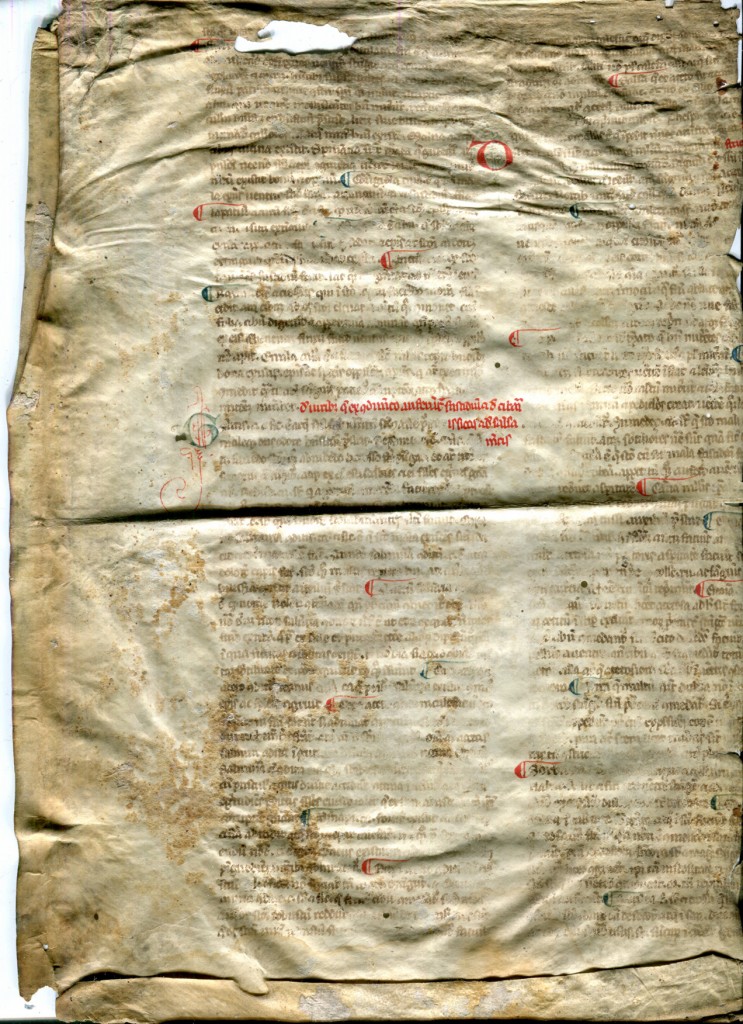
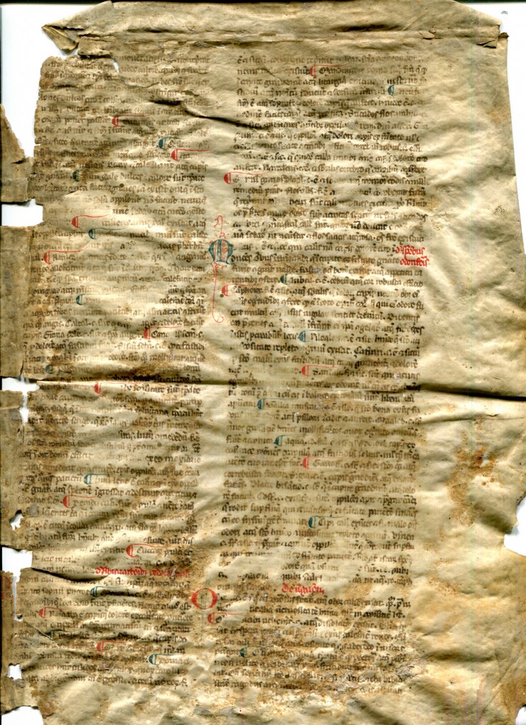
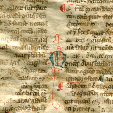
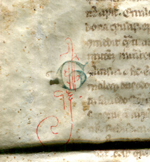
Here we show 1) the legible verso (folio Iv) and 2) the legible recto (folio IIr) of the inside of the bifolium, along with details of their enlarged and embellished initials. The initials, rendered rather simply in blue pigment with red pen-flourishing, stand to the left of the columns of text.
Within the sections which open with these initials, the internal items are run-together in paragraphs, but they stand separate by virtue of paraph-signs alternately in blue and red. The approach enables a dense coverage of text-per-page, albeit with a care for legibility of consultation. We should be so lucky with textbooks nowadays.
Folio Iv
Folio IIr
Initial Reactions
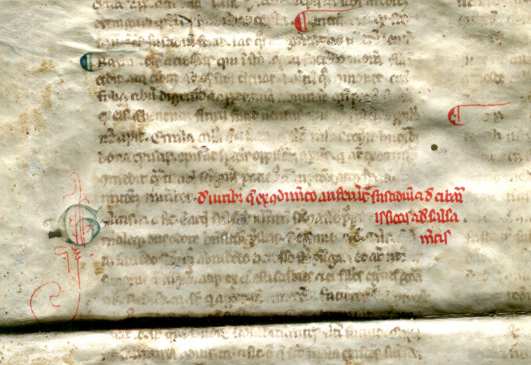
And now a close-up view of some of the initials, set to the left of the columns of text and embellished with pen-flourishes. Note that they have discreet cue-letters written in the ink of the text, standing at the left of the intended area for the initial and stating the letter form, as with G for G here.
The flourishes involve curves and coils as well as parallel lines and bulbous elements. Their assured quality of execution allows for recognition of a skilled hand offering forms of fantasy or whimsy within a sterner world of medical reference.
*****
We thank the owner of the bifolium for permission to reproduce and publish it.
Do you recognize the text? Do you know of other leaves from the same book, by the same scribe, or from the same center of production? We offer the images for further examination and, it may be, recognition. Please let us know. You could leave Comments here, interact with us on Facebook, or Contact Us.
*****

Hi, very nice post. I was looking for something similar to this. Thanks for this useful information.